Choosing the right color for your everyday artwork is both an art and a science. Whether you’re an aspiring artist, a hobbyist, or a professional illustrator, the colors you select can dramatically influence the mood, meaning, and overall impact of your work. With endless hues and shades available, how do you decide which colors best suit your creative intentions? This guide delves deep into the practical and psychological aspects of color selection, offering actionable insights and comparisons to help you make informed choices for your daily artistic projects.
The Psychology of Color: How Hues Influence Perception
Color is much more than a visual phenomenon—it’s a powerful psychological tool. Studies have shown that up to 90% of snap judgments about products can be based on color alone (according to research from the University of Winnipeg). Different colors evoke distinct emotional responses and can set the tone for your artwork.
For example: - Red is associated with passion, urgency, and energy. - Blue conveys calmness, trust, and serenity. - Yellow radiates happiness, optimism, and warmth. - Green symbolizes growth, health, and tranquility.The meanings of colors can also vary by culture. In Western societies, white typically represents purity and simplicity, while in some Eastern cultures, it can be associated with mourning. This underscores the importance of considering your audience when selecting a color palette.
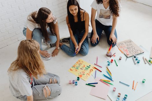
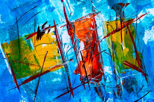
.png) When choosing colors for everyday artwork, ask yourself:
- What emotional response do I want to evoke?
- Who is my intended audience?
- What cultural meanings might my color choices convey?
When choosing colors for everyday artwork, ask yourself:
- What emotional response do I want to evoke?
- Who is my intended audience?
- What cultural meanings might my color choices convey?
Understanding the psychology behind color helps you craft artwork that resonates with viewers on a deeper level.
Understanding Color Theory: The Artist’s Toolkit
Color theory provides artists with a foundational understanding of how colors interact and combine. At its core, the color wheel consists of three primary colors (red, blue, yellow), three secondary colors (orange, green, violet), and six tertiary colors (such as red-orange and blue-green). Mastering these basic relationships allows you to create harmonious and visually appealing compositions.
Key concepts in color theory include:
- Complementary Colors: Hues located opposite each other on the color wheel (e.g., blue and orange). When used together, they create dynamic contrast. - Analogous Colors: Colors that sit next to each other on the wheel (such as green, blue-green, and blue). These combinations produce a sense of harmony. - Triadic Colors: Three colors evenly spaced around the wheel (like red, yellow, and blue). This scheme offers vibrant balance. - Warm vs. Cool Colors: Warm colors (reds, oranges, yellows) tend to advance in a composition, while cool colors (blues, greens, purples) recede.Experimenting with these combinations can help you find the right mood and balance in your everyday artwork. For instance, if you want to make a subject stand out, use complementary colors for maximum contrast. To create a serene landscape, lean on analogous or cool color schemes.
Practical Factors: Lighting, Medium, and Surface
Selecting the ideal color isn’t just about theory or emotion; practical factors play a crucial role. The way a color looks can change dramatically depending on lighting, medium, and the surface you’re working on.
- Lighting: Natural daylight shows colors most accurately. Artificial lights, especially those with a yellow or blue tint, can distort your perception of certain hues. According to the International Association of Lighting Designers, daylight bulbs (between 5000K and 6500K) are ideal for accurate color rendering. - Medium: Watercolors, oils, acrylics, and digital platforms all represent colors differently. Watercolors often dry lighter, while acrylics can darken as they dry. Digital colors are affected by screen calibration and display settings. - Surface: Paper, canvas, wood, and digital screens each absorb and reflect color uniquely. For instance, a rough canvas can mute colors, while glossy paper amplifies them.When starting a new artwork, always test your color choices on a small area first. This minimizes surprises and helps ensure your final piece matches your vision.
Color Trends and Personal Style: Balancing Influence and Authenticity
It’s natural to look to current trends for inspiration, but blindly following them can make your work feel generic. According to Pantone, the global color authority, 2024’s Color of the Year is Peach Fuzz—a soft, comforting hue. While incorporating trending colors can make your art feel contemporary, it’s crucial to balance this with your own artistic voice.
Ask yourself: - Do these colors align with the message or mood I want to express? - Are they consistent with my personal style or brand?A 2023 survey by the Creative Boom platform found that 68% of professional artists feel pressured to use trending colors, but 74% believe sticking to a personal palette helps their work stand out. Remember, authenticity is more memorable than trend-chasing.
To help you weigh your options, here’s a comparative overview:
| Color Selection Approach | Pros | Cons | Best For |
|---|---|---|---|
| Trend-Based | Feels current; attracts broader audience | May date quickly; less personal | Commercial, social media-driven art |
| Personal Palette | Unique; builds recognizable style | May not always align with trends | Signature works, portfolio building |
| Project-Driven | Tailored to message or client | Can feel inconsistent over time | Commissions, collaborations |
The key is to use trends as inspiration, not a rulebook, and to let your personal aesthetic shine through.
Tools and Techniques for Selecting the Perfect Color
Choosing the right color doesn’t have to be a guessing game. There are numerous tools and techniques artists use to make informed decisions:
- Swatch Cards: Many artists create swatch cards by painting small squares of each color in their collection. This helps visualize how paints look when dry and how they interact with different surfaces. - Digital Color Pickers: Online tools like Adobe Color and Coolors let you experiment with palettes, see complementary and analogous options, and test color harmony before committing. - Color Mixing Charts: For traditional media, creating a mixing chart helps you see the range of hues you can achieve by combining your paints. - Value Studies: Sometimes, the right “color” is more about value (lightness or darkness) than hue. Doing a quick grayscale study can clarify where you need more contrast.Many professionals also keep a visual diary or mood board to track color combinations that inspire them in everyday life. Over time, you’ll develop a keen intuition for what works best in your unique artistic context.
Adapting Color Choices for Different Purposes and Audiences
Everyday artwork can serve many purposes—personal exploration, social media sharing, client commissions, or gifts. Each context may call for a different approach to color.
- For Personal Growth: Experiment freely! Try unexpected combinations, break the rules, and see what resonates with you. - For Social Media: Bold, high-contrast colors tend to stand out in crowded feeds. According to Buffer’s 2023 data, Instagram images with dominant blue tones get 24% more likes than those with red tones. - For Commissions or Gifts: Consider the recipient’s preferences, décor, and cultural background. A commissioned family portrait, for example, might use warm, inviting tones that match the client’s home. - For Educational or Informational Art: Use colors that enhance clarity and readability. Avoid overly complicated palettes that may distract from the main message.Adapting your color choices to fit the context ensures your artwork connects with its intended audience, while still allowing space for personal expression.
Final Thoughts on Choosing the Right Color for Your Artwork
Selecting the right color for your everyday artwork is a multifaceted process that combines psychology, theory, practical considerations, trend awareness, and personal intuition. By understanding the emotional impact of different hues, mastering color theory, and using reliable tools, you can make confident choices that elevate your creative practice. Remember, there’s no single “correct” palette—art is about exploration and communication. The more you experiment, the more you’ll discover what colors make your work uniquely yours.