Color is a silent language that speaks volumes in the world of photography. From the vibrant hues of a sunset to the muted tones of a rainy day, colors are more than just aesthetic choices—they are powerful triggers of emotion, memory, and perception. But what does psychology say about the impact of colors on how we perceive photographs emotionally? Understanding the science and psychology behind color perception can unlock new creative possibilities for photographers and deepen our appreciation of visual storytelling.
The Psychological Foundations of Color Perception
Human response to color is not merely a matter of taste; it is deeply rooted in biology and psychology. Our brains process colors through a complex interaction of light, eye physiology, and neural pathways. The cones in our eyes detect different wavelengths, translating them into the colors we see. But beyond the mechanics, colors evoke instinctive emotional reactions—a phenomenon studied extensively in color psychology.
Research shows that color accounts for up to 90% of the first impression someone forms about a product, object, or image (Institute for Color Research, 2004). This immediate impact is leveraged in marketing, art, and, crucially, photography. Psychological associations with colors vary across cultures, but certain responses are nearly universal: red is often linked with excitement or urgency, blue with calmness, and yellow with optimism.
.png)
In a 2010 study published in the journal "Emotion," participants viewing images with warm color palettes reported heightened feelings of arousal compared to those exposed to cool-toned images. Such findings confirm that color choice in photography directly influences how viewers emotionally engage with an image.
How Specific Colors Influence Emotional Perception in Photography
Different colors elicit distinct emotional responses, and their use in photography can dramatically alter the viewer’s experience. Here’s a closer look at common color-emotion relationships:
Red: Associated with passion, energy, and even aggression, red is a commanding color. In portraiture, a red background or clothing can convey boldness or romance. However, overuse can induce anxiety or discomfort.
Blue: Frequently linked with tranquility, trust, and melancholy, blue is often used in landscape photography to evoke calmness (think of serene ocean scenes) or introspection.
Yellow: The color of sunshine, yellow is tied to happiness, optimism, and warmth. It can make a photograph feel cheerful and inviting, but too much yellow may be overwhelming or signal caution.
Green: Symbolizing nature, renewal, and balance, green is calming and restorative. It’s no wonder that nature photography is dominated by this hue.
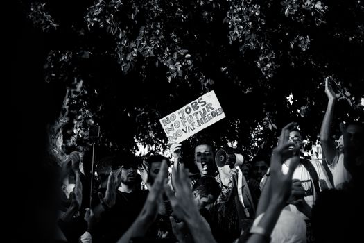
Black and White: Technically achromatic, black and white images strip away the emotional cues of color, focusing attention on contrast, shape, and emotion expressed through composition and subject matter.
A 2018 survey conducted by Shutterstock found that 41% of people associate blue with calmness, 39% link red to excitement, and 36% feel happiness when they see yellow. These statistics underscore the importance of intentional color choices in photography for emotional impact.
The Cultural Context: Do Colors Mean the Same Around the World?
While many color-emotion associations are rooted in biology, cultural context plays a significant role in shaping our perceptions. For example, in Western cultures, white is often associated with purity and weddings, but in many East Asian cultures, white symbolizes mourning and death. Similarly, red may signify good fortune in China but can indicate danger or warning in the West.
This cultural variation is crucial for photographers whose work reaches a global audience. A photograph using red as a dominant color might evoke excitement in one viewer and caution in another, depending on their cultural background. Color symbolism can also shift over time, influenced by media, fashion, and societal changes. For instance, the popularity of "Millennial Pink" in the 2010s shifted the perception of pink from strictly feminine to a broader symbol of youth and modernity.
Color Schemes and Emotional Tone: Comparison Table
Photographers often use specific color schemes to set the mood of an image. The combination of colors—whether complementary, analogous, or monochromatic—can greatly affect the emotional tone.
| Color Scheme | Description | Emotional Impact | Example in Photography |
|---|---|---|---|
| Monochromatic | Different shades and tints of a single color | Cohesive, harmonious, calming | Portraits with varying blues for a tranquil effect |
| Complementary | Colors opposite on the color wheel (e.g., blue & orange) | High contrast, dynamic, energetic | Urban shots with blue skies and orange lights |
| Analogous | Colors next to each other on the color wheel (e.g., green, yellow, orange) | Natural, serene, comfortable | Nature scenes with greens, yellows, and browns |
| Triadic | Three evenly spaced colors (e.g., red, yellow, blue) | Balanced, vibrant, playful | Street photography with bold, diverse colors |
| Achromatic | Black, white, and gray only | Timeless, dramatic, contemplative | Classic black & white documentary photos |
This table highlights how the deliberate choice of color schemes shapes the mood and narrative of a photograph, reinforcing the emotional cues intended by the photographer.
Scientific Studies Linking Color and Emotion in Photography
Beyond anecdotal evidence, scientific studies have explored the connections between color and emotion in visual media. A 2016 study published in the journal "Frontiers in Psychology" investigated how color saturation and brightness in photographs affected emotional arousal and valence (the attractiveness of an emotion). The study found that high-saturation, high-brightness images elicited greater excitement and positive emotions, while low-saturation, darker images were linked to sadness or introspection.
Another notable experiment involved showing participants a series of the same photographs digitally altered to different color tones. Results indicated that viewers consistently rated warmer-toned images (reds, oranges, yellows) as more energetic and positive, while cooler tones (blues, greens) were associated with calmness or even sadness.
In practical terms, photographers can use these findings to influence how their work is perceived. For example, a photojournalist covering a crisis might intentionally desaturate colors to convey seriousness, while a lifestyle photographer may amplify saturation to create a sense of joy and vitality.
Applications: How Photographers Use Color to Shape Emotional Narratives
Great photographers intuitively or deliberately use color to guide emotional perception. Steve McCurry’s iconic “Afghan Girl” is a prime example—the piercing green of the subject’s eyes against a red headscarf creates a striking contrast that draws viewers in and evokes empathy and intrigue.
Fashion photographers often use bold, high-contrast color schemes to inject energy and excitement into their images. In contrast, wedding photographers may favor soft pastels to create a romantic or nostalgic mood. Fine art photographers like William Eggleston have used color as the central subject of their work, transforming mundane scenes into vibrant, emotionally charged compositions.
Color grading—post-production manipulation of color—is a powerful tool in digital photography. By altering hues, saturation, or contrast, photographers can heighten or dampen the emotional tone. For instance, the “teal and orange” look popular in film and photography leverages complementary colors to make skin tones pop against blue backgrounds, creating a cinematic feel.
Why Understanding Color Psychology Matters in Photography
Recognizing the psychological impact of colors enables photographers to craft more intentional and impactful images. When used thoughtfully, color becomes a narrative device, guiding viewers’ emotions and enriching storytelling.
For example, a travel photographer capturing a bustling market might amplify reds and yellows to convey excitement and warmth, while a photo essay on solitude could use cool blues and desaturated tones to communicate isolation. Being aware of cultural differences in color perception can also help avoid miscommunication and make images resonate with diverse audiences.
Moreover, as research continues to reveal the intricate links between color and emotion, photographers can leverage these insights not only for artistic expression but also for commercial success. Brands and advertisers already capitalize on color psychology; photographers can apply the same principles to make their images more persuasive and memorable.
Exploring the Emotional Power of Color in Photography: Key Takeaways
The interplay between color and emotion in photography is a fascinating blend of art and science. Psychological research confirms that color choices—whether through intentional composition, color grading, or natural settings—profoundly influence how images are perceived and felt. By understanding the emotional language of color, photographers can create work that resonates more deeply with viewers, transcending cultural and linguistic barriers.
Whether you are an amateur with a smartphone or a seasoned professional, being mindful of color’s psychological impact can elevate your photography from visually pleasing to emotionally compelling.